
One of the most daunting parts of the self-publishing process is the cover design. It is the first part of your book that potential readers will see and it is what will compel them to click and learn more. There is a real art to book cover design and it is so incredibly important to your novel’s success that you have a good one that will catch people’s attention.
I have self-published two books (one of which you can read right here on Fictionate) and I know that all the thought and consideration I put into their cover designs has contributed greatly to each book’s sales. Through my experience, I have learned several tips and tricks to ensure that you will end up with a beautiful, evocative book cover. Here are 10 cover tips that will help your book stand out in the crowd.

1) Do Your Research
Great book cover design always begins with a lot of research. You have to ask yourself what exactly you want your cover to look like. Is it something simple and abstract like a set of geometric shapes? Will it be the image of a flower or a creepy old manor? Or maybe one or more of your characters (more on that below)?
I personally spent a lot of time Googling images relevant to my story, and people who I thought resembled my main characters in some way. Another great way to research is to go on Amazon or wherever you’re planning to self-publish and study the covers of the most popular stories in your genre. What do they have in common?

2) Save Up
There are plenty of ways to design your book cover for free. Canva has a great free book cover maker and there are sites like Pexels and Pixabay that are full of free images you can use. But I highly recommend saving up some cash to get your cover professionally designed. No matter how nice you think your homemade cover looks, I can guarantee that a pro designer is going to be able to use years of know-how to make something better. I went with Ebook Launch for both my covers and never regretted the expense for a moment.
If you really don’t feel like you can afford to get your cover professionally designed, you can wait a while to self-publish until you can save up the money. If you even put just aside $10 a week, you’ll have more than enough in a matter of months. This is not an aspect of self-publishing to skimp on—you owe it to yourself and your story to arm it with a professional-looking cover that will stand out.

3) Trust Your Designer
Once you’ve hired that professional designer, it is important that you trust them. Of course you should try to communicate your vision to them and provide some of those images you found in your research for reference. But don’t micromanage.
Have an open mind. Give your designer room to play around with the cover. They may have ideas that you never would have thought of. The designer who worked on my Vita and the Moorhouse cover had the idea to include an “M” in the gate and now it’s one of my favorite parts of the image. I also left the fonts for Viable up to the designer and wasn’t disappointed.
4) Know Your Niche
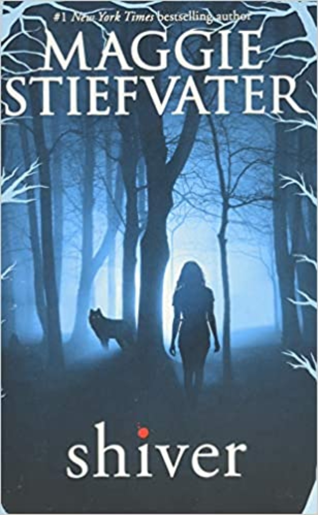
In your research, you will begin to understand the look of books in different genres. People in different audiences are looking for different things, and you should try to capture the essence of your genre with your cover. If you’re writing horror, that should be clear from your cover. If your book is fantasy, we should see some sign of whimsy or perhaps a creature like a unicorn or a dragon.
Now would be a time to drop in on friends who are fans of your chosen genre. Study their bookshelves and try to look for what the book covers have in common. You can also ask what those friends look for in a book cover when shopping. Nailing the tone of your cover will help prospective readers to find your book.

5) Stay on Theme
With your cover, you want to give readers a sense of what your book is about. The cover of Fahrenheit 451 by Ray Bradbury gets right to the point—books burn in the background while a burning man clothed in book pages cries in the foreground. Immediately you know that this is a book about censorship and a man’s harrowing journey toward accepting the truth of his dystopian society.
One exercise you can try is boiling your story down to one sentence. I know as someone who has done it for multiple books that it is excruciatingly hard. But this exercise in conciseness will help you to see the big picture of what your story is trying to say. In doing so, you may be able to figure out an image for your cover that stays true to your story’s overarching theme.

6) Introduce Your Protagonist
Your book cover gives you the chance to introduce your protagonist to the reader. This could be done abstractly—the image on your cover could be a guitar since your protagonist plays the guitar, or a beret since she always wears a beret.
Or you could go more literal and have an image of your protagonist on the cover. With Viable, I always knew I wanted to have my protagonist Baine on the cover. The novel is written in first person and her voice shapes how the reader processes the story, so it seemed fitting to put her on the cover. I sent images of how I thought she would look to the designer, and he sent back similar images that captured the essence of what we were looking for, and this is the one we chose. People react to images of people—their sense of empathy helps draw them in and (hopefully) click the “Buy” button.

7) Keep It Simple
Just as it is difficult to boil down your story down to one sentence, it is similarly tricky to narrow things down to just one image. As you consider your novel, you’ll likely come up with several images that might work for your cover. You may feel tempted to try to recreate a whole scene from the book.
Resist that temptation. Eye-catching novel covers are ones that keep it simple. Choose a character to put on the cover, or a single evocative item that gives the reader some hint as to what your book is about. A good example is the cover of The Hunger Games by Suzanne Collins. It prominently features Katniss’ mockingjay pin—an image that draws the eye and makes you want to know more.

8) Make Your Cover Text Easy to Read
One common mistake new authors make is neglecting to make the text on the cover legible. When choosing fonts, make sure it’s a font that’s easy to read. Your title should be large and prominent—you don’t want readers having to squint to read it. Any other text like a tag also needs to be readable.
Part of this comes down to your color scheme. If you have a light background, you won’t want to use a light color like yellow for your text. Similarly, if you have a dark background, you don’t want a dark color like navy blue for your text. With the cover of Catch-22 by Joseph Heller, the large, white title stands out against a blue background.

9) Think Small
When readers encounter your book, they’re not going to see your cover in its full-sized glory. It will be the size of a thumbnail, listed with other potential reads on either side. Remember that your cover image needs to be recognizable and legible even when it’s reduced to a small size.
So when you have a rough design of your cover, reduce it to thumbnail size and make sure you can both read the title and recognize what the central image is. Other graphic elements shouldn’t be competing with your title—they should exist harmoniously. Work to make your cover one that is every bit as lovely tiny as it is in its full size.

10) Use Social Media to Get Feedback
Cover design is a great time to call on your social media pals. No matter how big or small your following is on Twitter or Instagram, it’s worth it to toss your cover image up and ask for opinions. Your followers will be able to give you insights you never would have come up with on your own.
I have tested out both the covers of my books on my Twitter followers and they provided a ton of helpful feedback. One follower noted that Viable’s tag was hard to read, and another pointed out an issue with the shadow reflected by the gate on Vita and the Monsters of Moorhouse’s cover.
I know it can be stressful trying to decide on a cover for your book. Hopefully, these tips will help you move forward with confidence in your self-publishing journey and produce a gorgeous, exciting cover that will draw potential readers in and won’t let go.